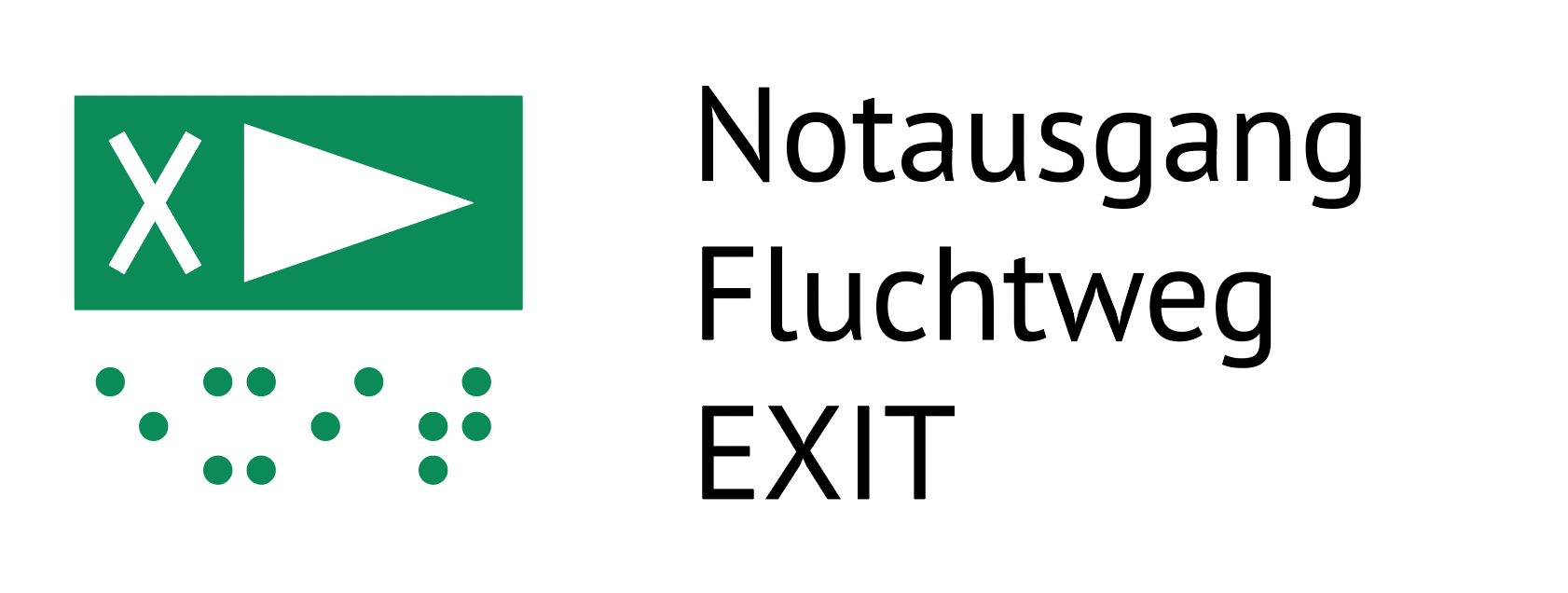
No question, the challenge is immense and so is the responsibility. An internationally understandable symbol was sought that speaks for itself tactilely and also visually. Orientation plans are a shared aid for both sighted and blind people. Particularly in an emergency, information must be grasped quickly. Until now, a sign has been missing from industrial standards and current draft standards. Thus, we have developed a new sign in recent weeks and submitted it to the commission.

It plays a significant role for the speed if symbols are already learned and do not have to be reinterpreted. The symbol for the emergency exit and escape route must indicate a clear direction and it must be possible to distinguish it from the ordinary exit. Even illiterate people and people speaking foreign languages should have no difficulty with this.
Thus, we have used the X for “ exit“, „out“, „away“ as the lowest common denominator, and the large directional arrow on green, which is also known from the visual world. In the application in the plan, the symbol is placed rotated in the direction of escape. The white elements are tactile and the green area is to be printed visually only. The minimum height is 12 mm (green frame)!
